E9.2 JET graph javascript needed :)

JohnDanter2

JohnDanter2

VIP Member
Hi all

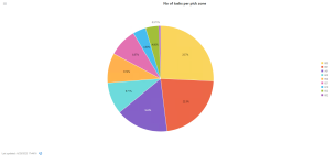
Is there anyone out there who has made a JET graph PIE chart on a composite page that uses the follwoing please


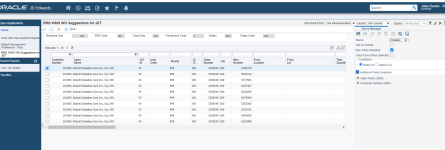
1) It's a grid view APPL request (not a BSVW request)
self.isDataRequest = false;

2) It's a pie chart
self.chartType = ko.observable('pie');

3) The AIS call uses grid data and is a form service
var needs

outputType : "GRID_DATA"

callAISService(input, FORM_SERVICE, function (response)

4) there is aggregation or counts of a total to make a pie chart

I am struggling to find one of these in E1s downloadable tutorial examples. I am hoping there is a dashboard graph out therere that does all of the above for me to copy and change into my own graph and application

Thanks

John
 
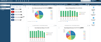
Me and my java geek have managed to get this working and I'll be happy to create a tutorial on how to make these graphs, after I master bar charts too lol

The javascript is made into blocks that first decreibe the pahe behavior, then build up the AIS call (to a form or BSVW) and the aggregation etc, then there is the consume part, then the final push to the graph

All quite cool and super powerful. You can jump out to UDCs, address books and even call orchesrations or UBEs etc or even another chart for the data in each segment. I am super excited to see where this will take us

A fanstastic learning experience, made possible by canabilising existing role based page graphs and looking at what they do and how. But you need some javascript AND E1 development skills or at least someone on your team good with javascript you can guide and iron out what you're trying to do.

image.png
 
Last edited:
Was thinking the same thing :D
Yes Don and Dave there defineatly needs more info out on this stuff.
The templates Oracle give you to download in thier E1JETDeveloper zip file are mostly dataservive requests. If you want to run over a form its a bit different.

Then when you think abut the WO manager screen they have, where you can drag and drop WOs to different lines/days etc, you start to think 'of course' these graphs can do more than just display info. You can interact with it too!!! Which is awesome

Let me carry on with my other graphs first, get them live tested, then I'll do a tutorial.

I'll stick the javascript up here soon, maybe today in the meantime
 

Attachments

  • 1688107351211.png
    1688107351211.png
    104.2 KB · Views: 13
Hi all
I'm happy to say we've nailed these dasboards. Once you get up and runnnig other graphs are quite easy to make

Oracle do have E1JETDEveloper kits to download on the ESU centre and will help you make graphs, but there are so many way to make a grpah you need to make sure the templates given match your needs. In my case it didn't

I needed my AIS calls ti run the actual APPL to make data, not the underlying BSVW

So here is how you run an APPL
callAISService(input, FORM_SERVICE, function (response)
Here is how you run a BSVW
callAISService(input, DATA_SERVICE, function(response)

There is also an attribute at the top called
self.isDataRequest = true;
or
self.isDataRequest = false;

I will explain the difference in my upcoming post below that will paste my javascript. I've added comments where I can

1688747821842.png
 
Hi all
I'm happy to say we've nailed these dasboards. Once you get up and runnnig other graphs are quite easy to make

Oracle do have E1JETDEveloper kits to download on the ESU centre and will help you make graphs, but there are so many way to make a grpah you need to make sure the templates given match your needs. In my case it didn't

I needed my AIS calls ti run the actual APPL to make data, not the underlying BSVW

So here is how you run an APPL
callAISService(input, FORM_SERVICE, function (response)
Here is how you run a BSVW
callAISService(input, DATA_SERVICE, function(response)

There is also an attribute at the top called
self.isDataRequest = true;
or
self.isDataRequest = false;

I will explain the difference in my upcoming post below that will paste my javascript. I've added comments where I can

View attachment 19725
your metrics and then your use of them to make graphs is great. People love their graphs without any regard for good data, and it looks like you have some really interesting data. Thanks for sharing, and I guarantee you'd have a speaker exemption if you presented this at conference. If you have any interest in presenting virtually to TechSIG, let @DSauve or I know.

It will take me time to digest your script but I hope to try similar things out soon.
 
Thanks Dave

Just look at the funcrions one by one and itll make sense

The metrics are what was requested by the global business dude. He's a good egg and knows his supply chain metrics really well.

We downloaded E1s Warehouse Manager dashboard to showcase and people loved if.
I then used those pies and bars to make my new graphs.

It is quite simple once you break the steps down. Just takes a while to figure out what you need to change/tweak.

I'll write up a better tutorial over the next few weeks
 
Last edited:

Similar threads

Back
Top